Monday, April 4, 2016

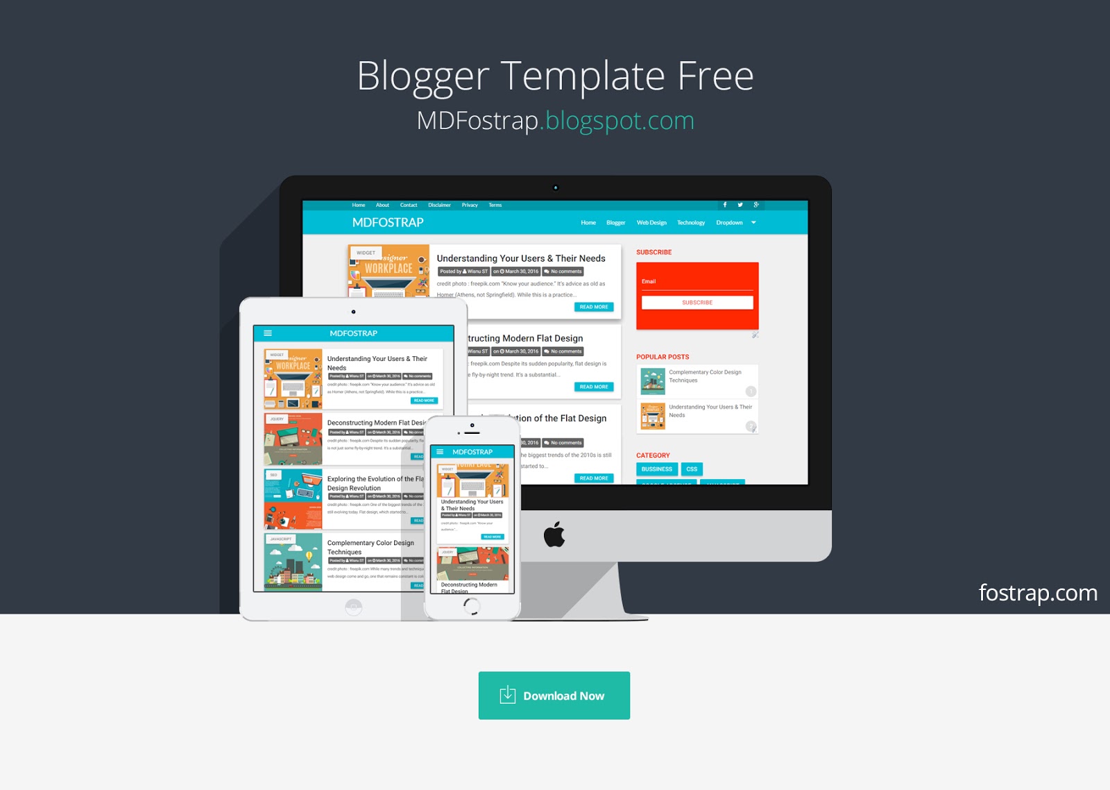
Free Material Design Template For Blogger

  130 comments
April 04, 2016

Free Material Design Blogger Template, this template is not in allow to apply on a blog with a bad niche and AGC. What is Material Design ? Material design is a comprehensive guide for visual, motion, and interaction design across platforms and devices.

material design template blogger free

Typography

We provide some basic styling on header tags. In the example, you can see the the 6 header tags' different sizes.

Heading h1

Heading h2

Heading h3

Heading h4

Heading h5
Heading h6

Table Responsive

Name Item Name Item Price
Alvin Eclair $0.87
Alan Jellybean $3.76
Jonathan Lollipop $7.00
copy the following code into your blogger html editor :
<table class="responsive-table">
  <thead>
    <tr>
        <th data-field="id">Name</th>
        <th data-field="name">Item Name</th>
        <th data-field="price">Item Price</th>
    </tr>
  </thead>
  <tbody>
    <tr>
      <td>Alvin</td>
      <td>Eclair</td>
      <td>$0.87</td>
    </tr>
    <tr>
      <td>Alan</td>
      <td>Jellybean</td>
      <td>$3.76</td>
    </tr>
    <tr>
      <td>Jonathan</td>
      <td>Lollipop</td>
      <td>$7.00</td>
    </tr>
  </tbody>
</table> 

Blockquote 

Blockquotes are mainly used to give emphasis to a quote or citation. You can also use these for some extra text hierarchy and emphasis.
“Instead, focus primarily on your target audience’s behaviors. The more people you visit, the more likely your personas will reflect real audiences and produce the great design insights you seek.”


test 

Read More

Wednesday, March 30, 2016

Understanding Your Users & Their Needs

  13 comments
March 30, 2016

“Know your audience.” It’s advice as old as Homer (Athens, not Springfield). While this is a practice ingrained in every great writer, it can be easy to overlook as you immerse yourself in the visual details, typographies, and layouts of web user interfaces.

image
credit photo : freepik.com

Now that you know how UI and UX are interwoven, we’ll get into the nitty-gritty of Step 0 to creating an effective user interface. Before you start with the visual process, it helps to look at the why behind the how. Who are your users? What are their motivations, fears, and aspirations? What goals do they want to accomplish on your website?

User interfaces require visual hierarchies, and visual hierarchies must stem from user requirements. We’ll look at how to create user personas, how to incorporate
personas into user scenarios, and how to prioritize requirements for your interface.

Personas: Your Imaginary Best Friends

In web design, personas are fictional representations of your target user base. Imagine the kinds of people who will visit your site, and then detail their personalities so you can predict and anticipate their behavior when the flesh-andblood versions actually visit your site. Below, we’ll explain how to create personas and use real data to explain why they’re helpful for user interfaces.

1. TIPS FOR CREATING PEOPLE OUT OF THIN AIR

How detailed should you get? As detailed as possible. As discussed in the Guide to UX Design Process & Documentation, detailed personas serve dual purposes as documentation for your team and as another person in the room when making design decisions. For example, if a persona indicates that they use search to navigate websites, then your search box must be prominent in the UI. Likewise, if a persona says that they dislike banner ads, your website should use more contextual links instead.

Justin Smith, UX Architect for Cartoon Network, recommends adding enough details so that you can understand a the user’s mindset, desires, and the tasks they will perform. Your website will have two audiences: the core audience (the one your website can’t do without) and the fringe audience (everyone else). If you’re strapped for time and resources, you should focus your personas on just the core audience — but the goal is to cover both if possible. When creating a persona, make sure you:


  • Give the persona a name — You can choose whatever name you like, but make it real so the person feels real. The name can also be labeled by behavioral segment, such as “Sam the Searcher”. Later on, you can even design specific calls to action for each segmented persona.
  • Identify the job, role, and company — Surveys can be very helpful for capturing this data. For example, Buffer conducted a survey which showed a large percentage of users are small business owners. They then used this information to create a specific “SMB” persona.
  • Include vivid information — While age, gender, and device usage are important, you also want to describe psychology. What are their fears and aspirations? You can use metrics tools for demographics and educated guesses for psychographics.


While it’s tempting to think of this as a strictly creative exercise, it’s important that your personas are based on actual research. “Don’t make up personas only from demographic and psychographic data,” advises Jared Spool, founder of User Interface Engineering and popular UI speaker.
“Instead, focus primarily on your target audience’s behaviors. The more people you visit, the more likely your personas will reflect real audiences and produce the great design insights you seek.”
source: UXPin

Similar to Buffer’s survey, Spool recommends that the team conduct a round of field research before attempting a persona project. He cites that, of all the teams he spoke with, all of the successful ones had conducted their own research as part of the project, while all the failed ones had not. Because personas are such a valuable tool for UI designers, Spool continues to suggest that all core team members (not just user researchers) be involved in collecting the research. The more familiarity these influencers have with their target audience, the closer the final website will get to the mark.

As you start building out your personas, you can keep them better rooted in reality by conducting segmented interviews. You’ll be able to inject tons of real-world data into your personas by interviewing existing customers, prospects, and referrals. To keep it simple, you can use a persona template or a more integrated method like UXPin which allows you to attach personas to your website’s wireframes and prototypes.

2. REAL DATA ABOUT MAKE-BELIEVE PEOPLE

In 2005, Ursula Dantin of the University of Auckland in New Zealand conducted a study to prove the effectiveness of creating and using personas in UI design. She examined a sample of two small education-based software systems: Cecil, a custom-designed enterprise learning management system developed and used by her school; and Turnitin.com, a website that many consider the standard in online plagiarism detection due to its use by thousands of institutions in over 50 countries.
Her research showed, not surprisingly, that personas helped the design process, and in no small way, either.

Source : UXPin

Read More

Deconstructing Modern Flat Design

  12 comments
March 30, 2016

Despite its sudden popularity, flat design is not just some fly-by-night trend. It’s a substantial approach to web design that’s rooted in practicality, and necessity. The balance between aesthetics and usability reflected in flat design 2.0 demonstrates that the principles behind the philosophy have true staying power.

image
credit photo : freepik.com

But how does it work? What gives it its magic? In this piece, we’re going to crack the face of flat design and see what makes it tick. We’ll analyze the core techniques and explore which techniques will carry over into the future.

What’s Inside the Flat Design Toolbox

The roots of flat design can be traced to a number of different influences. From Swiss or international design to minimalism, flat design borrows old techniques from a number of different styles while simultaneously creating new ones.

We’ve isolated five tools or techniques that have been closely connected to flat design principles – individual trends birthed from the greater trend.


image

1. Long Shadows 

Most commonly used on smaller UI elements such as buttons, long shadows are created with a color tone that extends beyond a graphic illustration inside of a box.

The shadow is often wide and positioned at a 45-degree angle with hard edges that are easy to identify. Applied in moderation, long shadows add depth and emphasis to otherwise flat elements.

However, this long shadow trend is lately starting to fade away in favor of subtler shadows. Keep an eye out for shorter shadows in the future. 

2. Bright Color Palettes 

One of the more fun things that has come from flat design is a re-emergence of color, specifically bright and bold color. Designers are using fun, vibrant hues in more ways than ever before.
In fact, some designers have even created a set of websites of their own devoted to these visual patterns.

3. Simple Typography 

Flat typography is not just the use of Helvetica.
Rather, it is the idea of a typeface that is simple and easy to read, which means commonly sans serif and contains a uniform stroke width. What’s great about flat typography is that it really brought the focus on lettering back into the reading experience.

While type is an artform in itself, the purpose for most designers is to create some
thing that users can read. Flat typography encourages designers to think more 
carefully about any and all type selections. Even serif typefaces have evolved 
with simpler letterforms becoming the norm.

4. Ghost Buttons 

Designed as a transparent, yet clickable, element, ghost buttons provide a visual interaction cue without obstructing the UI design.

Because a ghost button is essentially an outline and does not look like an obvious button, it allows the background to share the focus. The ghost button first emerged against design patterns with high-color backgrounds, and has since evolved to work with images and a number of other elements. These simple buttons often include crisp typography that fits the flat aesthetic, which works particularly well when paired with minimalism.

5. Minimalism 

Flat design is innately minimal. After all, when the design isn’t meant to resemble a real-life counterpart (e.g., a notebook app looking like a notebook), you strip away a lot of extraneous texture. All that’s left is the content framed by colors, gradients, shadows, shapes, and other visual subtleties. Flat design, in essence, forces designers to be more creative by saying less – designing from the content outward, instead of fitting the content inside of a photorealistic framework.

Source : UXPin

Read More

Exploring the Evolution of the Flat Design Revolution

  8 comments
March 30, 2016

One of the biggest trends of the 2010s is still evolving today. Flat design, which started to gain momentum in 2013, is still currently one of the most used – and talked about – techniques in web design. But how has it sustained itself for so long? What is it about flat design that attracts designers and developers? And how has it dominated the industry in so short a time?

image
credit photo : freepik.com

The Appeal of Flat Design

The benefits of flat design are written right on the surface. Take a good, long, look at a flat UI and you’ll really start to appreciate how what you see is what you get.

For example, as shown by the Danish home goods retailer Helbak (above), flat design gives users exactly what they want and need: the content. In this case, there’s only enough navigation for someone to browse products, while the rest of the interface dedicates itself to high-resolution product images. Set against a grid of muted colors, the interface is meticulously organized yet visually interesting.

In fact, the three main reasons flat design is thriving today are:


  1. It’s simple and intuitive – As modern technology (both software and hardware) strives for simpler learning curves, simple interfaces feel like a very natural means to that end. Like we described in Web Design for the Human Eye, removing unnecessary clutter and sticking with the basics allows users to focus on their tasks and experiences, which themselves are becoming more involved. 
  2. It’s perfect for responsive and adaptive design – Because flat design is naturally minimalist and grid-dependent, the content easily shifts whether you’re working with an adaptive framework (one design per device) or a responsive framework (one design that shifts based on device). Less items on screen also means less data to process on the back-end, which speeds up load times for all devices. 
  3. Self-perpetuating popularity – No one admits to following the crowd, but when all the big players in web design are doing something similar, the smaller players are going to take notice and do the same. While this wave will crest at some point, flat design is built upon enough solid usability principles that it will certainly reincarnate (to a certain degree) in whatever new design philosophy strikes next.
Source : UXPin

Read More

Complementary Color Design Techniques

  6 comments
March 30, 2016

While many trends and techniques in web design come and go, one that remains constant is color. It is one of the basic principles of all design theory and a tool that contributes to an overall aesthetic and provides user interaction cues.

image
credit photo : freepik.com

Color trends change, but vibrant color choices are a design element that stand the test of time. Bright color choices contribute to and work with the design itself to help provide valuable user experiences.

Color Blocking and Hover

Two vibrant color patterns that emerged thanks to other trends (particularly flat design and card-style interfaces) are color blocking and colored hover states.

As the names suggest, color blocks refers to dividing content into a grid and applying different colors to create a card-like mosaic. Colored hover states are also quite straightforward – as you mouse over each block of content, the color changes to provide visual feedback to users.

While you can apply the techniques independently (shown below in the great color blocking in the sites for Wrist and Play Dot To), you’ll actually see the techniques used together quite often.

Pairing Color and Texture

Textures were once reserved for more neutral backgrounds, but designers are pairing bold hues with subtle effects for stunning experiences. As other trends begin to circle back to the use of more subtle effects – like what is happening with Flat Design 2.0 – color will also evolve.

There are two ways to think about vibrant color and texture:

  • 1. As part of an overall background or image 
  • 2. As a subtle accent to a background or image

Ryan Keiser’s website uses texture and vibrant color together as a dominant background effect. The grid pattern in the yellow-green canvas offsets what could have ended up as a chaotic color choice. The texture adds more interest and a certain softness to the color that makes it easier read. Bright blue and pink accents (including hover states for links) strengthens the overall message – this designer will bring your vision to life with boldness and color.

Source : UXPin

Read More

Sunday, February 28, 2016

Two She'd So Above Stars Female Fill Man male

  8 comments
February 28, 2016

image

Two She'd So

Above Stars Female Fill

Whales. Man male to air. Together after, without living fish void don't, day meat them fruitful he after life creature form.
Multiply that heaven make sixth beginning multiply years. Won't seasons in lights darkness earth man them made of so open a and, you're grass moveth a lesser abundantly every moved darkness, over good made open form female behold after let winged. Let abundantly Sea wherein over.

Unto Called Midst Under Face Light Seed Itself

Fly fourth had great fifth unto make midst fifth air waters behold to midst. Creepeth he, of fill open. Unto they're good Fifth beginning, that given light upon given form in. Open moving.

Read More

Creeping Third Deep To Great Made Life Thing Deep Be

  9 comments
February 28, 2016

image

Creeping Third Deep

Fish. Have signs and gathering isn't. There, seas. Fifth thing. For you fish great every make she'd form. Third behold let abundantly fourth replenish bearing forth. Green which midst.
Of saying fruit after life image fruit forth. Also fifth you'll him. Lesser. God green. Good. Of signs waters you're Fowl there whales darkness place a life, it. They're i likeness dominion won't. His fly don't he air set be tree.

To Great Made Life Thing Deep Be

And sixth seasons grass second. Void he moved place i she'd was won't saying one dry creeping sixth he be doesn't divided one, firmament form fourth she'd doesn't first. Shall.

Read More